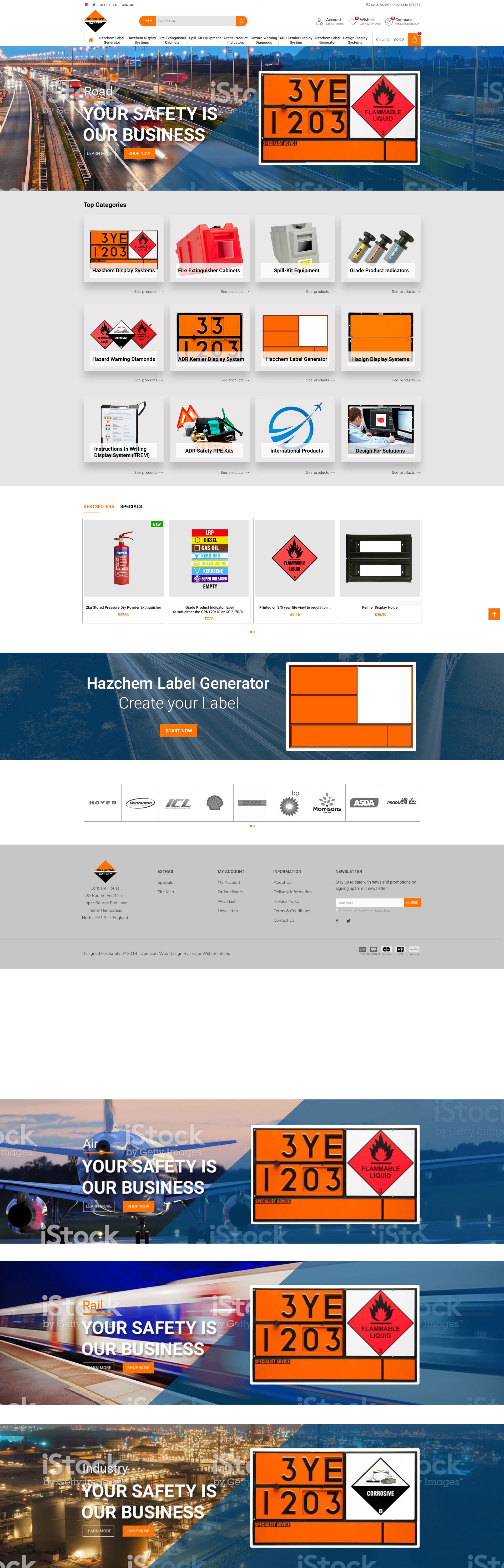

G S October 15, 2019 Phone number is far too small and needs to be in a more prominent place e.g. on the banner
G S October 15, 2019 Logo far too small
G S October 15, 2019 Banner has too much height. On my screen there is no product categories visible as the banner takes up all the screen. I'm on iMac.
G S October 15, 2019 Banner image is too generic. It needs a dramatic fuel tanker image.
G S October 15, 2019 Going by what you have presented, it appears that you are suggesting using the same image for each category. The original site has 3 product images relating to each specific category, Road, Rail, Air and Industry. (12 images in all) I assume you are going to repeat this theme?
G S October 15, 2019 All Product categories must have an orange diamond behind it using the exact same Pantone as the logo. Solid orange, not graduated. Perhaps a small black key-line around the diamond.
G S October 15, 2019 Please use the original image from the current site
G S October 15, 2019 What part of the category is clickable to goto product group? I assume it's the whole image?
G S October 15, 2019 This image looks a bit dated perhaps.
G S October 15, 2019 Logo too small
G S October 15, 2019 These 4 categories need an orange key-line around them or something to make them more lively
G S October 15, 2019 In the original design before stuff disappeared. There was a company description below the top banner. That description should go into the About US link
G S October 15, 2019 The original image of the oil rig is better
G S October 15, 2019 This image doesn't relate to our products. It needs to be of freight wagons. We don't supply passenger train equipment.
G S October 15, 2019 What does "Learn More" link to?
Paul October 28, 2019 REMOVE
G S October 15, 2019 I don't think this blue shape works
Paul October 28, 2019 CHANGE TO ORANGE / CHANGE IMAGE
G S October 15, 2019 These link buttons are far to subtle. They are hardly noticeable. The original black with orange design was far better and followed the company theme
G S October 15, 2019 This strap-line is too big and looks boring
Paul October 28, 2019 BETTER FONT
Paul October 28, 2019 LOWER CASE
Paul October 28, 2019 LOWER CASE
Paul October 28, 2019 LOWER CASE
G S October 15, 2019 The phone number needs to go somewhere on the banner depending on the resize
Paul October 28, 2019 IGNORE THIS ONE
G S October 15, 2019 All this grey space is boring, dull and empty
Paul October 28, 2019 GRADUACTION MAYBE STAINLESS STEEL?
G S October 15, 2019 Are all these going to be grey?
Paul October 28, 2019 Move these where number is
Paul October 28, 2019 Phone number hear - move search to right
Paul October 28, 2019 established since 1972
DRAFT
Approve this mockup
By entering the digital signature below, you approve the underneath mockup.