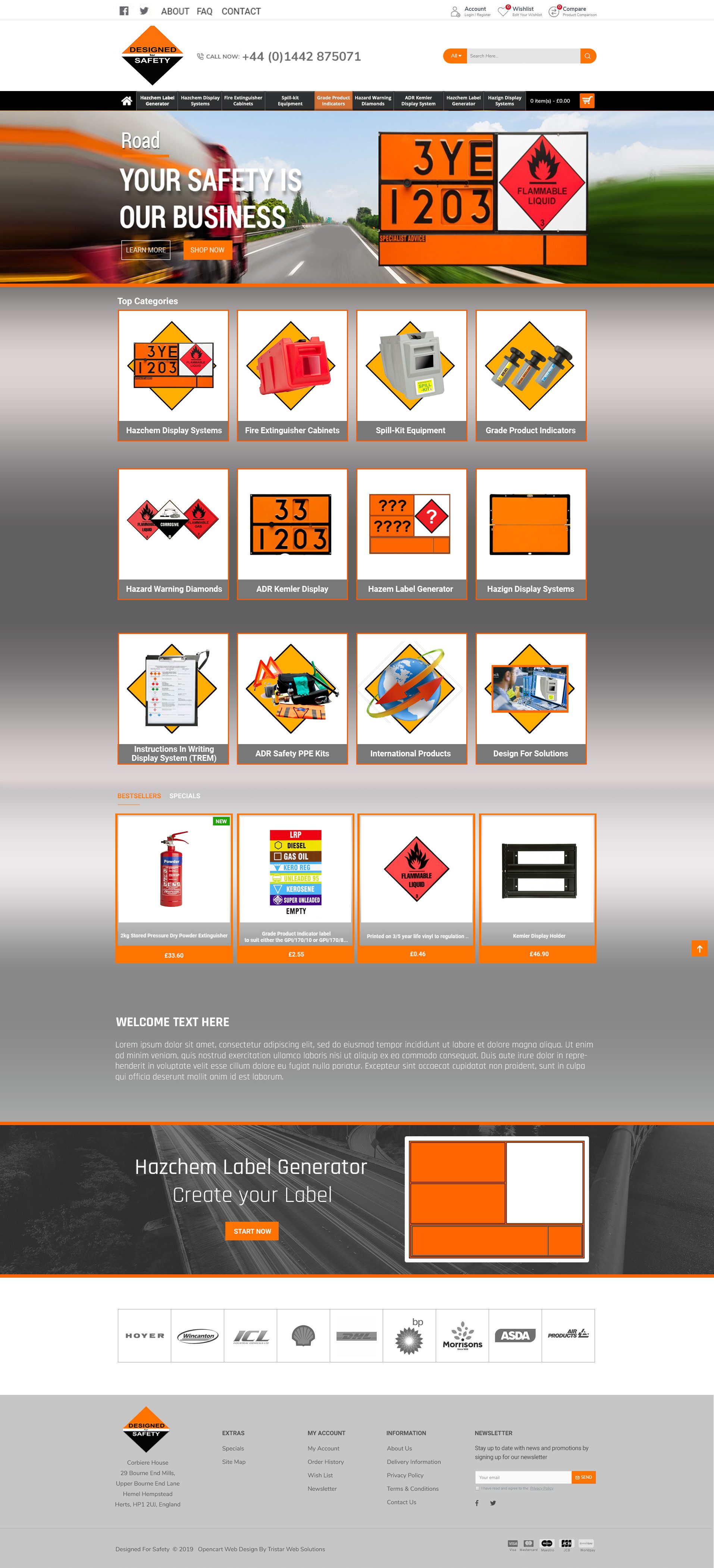

Gary April 22, 2020 A border along this line would help devide the banner from the page. Orange or graduated steel as with the existing site.
Gary April 22, 2020 The colour blue doesn't relate to anything on the site. Orange or dark grey or both combined as a graduation. I may try to find a more suitable image.
Gary April 22, 2020 Border between these sections as above
Gary April 22, 2020 Will these be bevelled to look like buttons?
Gary April 22, 2020 None of the banner wording sizes or font are the same
Gary April 22, 2020 None of the banner wording sizes or fonts are the same. They don't line up on the left either.
Gary April 22, 2020 This seems very small and as we need to encourage people to contact us, perhaps we could move it and make it bigger
Gary April 22, 2020 None of the banner wording sizes or fonts are the same
Paul Hodson July 2, 2020 Top of logo clipped
Paul Hodson July 2, 2020 Top of logo clipped
Paul Hodson July 2, 2020 squashed not a diamond
Paul Hodson July 2, 2020 not same orange change
Paul Hodson July 2, 2020 not visible enough, bevel should stronger
Paul Hodson July 2, 2020 more creative
Paul Hodson July 2, 2020 more creative
Paul Hodson July 2, 2020 repeat wants to fade always want extended one grey fade in and out in and out
Paul Hodson July 2, 2020 white line
Paul Hodson July 2, 2020 rad bigger
your safety smaller
DRAFT
Approve this mockup
By entering the digital signature below, you approve the underneath mockup.