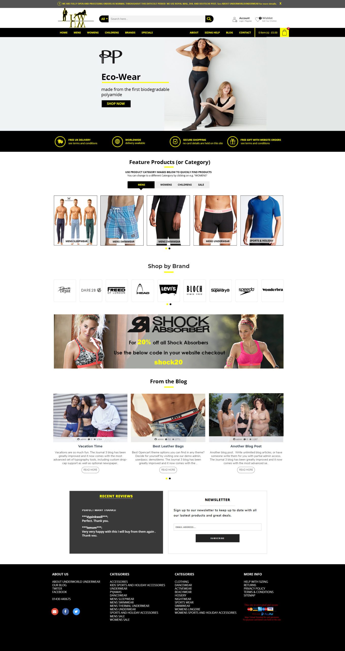

Trevor Smith (all) October 9, 2020 Why grey? Should be black
Trevor Smith (all) October 9, 2020 Why grey? Should be black
Trevor Smith (all) October 9, 2020 Overall effect/ impact of the top of the page is not impressive. No impact. Looks unprofessional.
Trevor Smith (all) October 9, 2020 The logo on our original site look "placed". It is bigger and split horizontally between a black top bar and a white bar. It looks like part of the site - not just "an image"
Trevor Smith (all) October 9, 2020 The text here should be bigger
Trevor Smith (all) October 9, 2020 The text here should be bigger
Trevor Smith (all) October 9, 2020 Is this a slider bar??? If so where are the control arrows? Also the image is not very big. A slider should utilise the whole width of the page
Trevor Smith (all) October 9, 2020 The basket icon should be bigger. This whole bar should be bigger and more prominent
Trevor Smith (all) October 9, 2020 This text/ etc. should have more impact. Also the default should be Womens if we are displaying images as most of our customers are women.
Trevor Smith (all) October 9, 2020 If this is a slider bar Where are the slider control chevrons?
Paul October 9, 2020 Test
Paul October 9, 2020 Test
DRAFT
Approve this mockup
By entering the digital signature below, you approve the underneath mockup.